19.6.12

holiday in cambodia

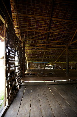
We're always on the lookout for photo-worthy homes. During Justine's recent travels around Cambodia, she discovered a small village where homes are unobtrusive structures built purely for shelter. 

Unadorned and basic, but beautiful in their simplicity, these handcrafted homes remind us that perhaps, just sometimes, we overestimate our needs.


The ultimate in open plan living - each hut is just one room.
The whole family will cook, eat and sleep together.


The kitchen stove.

The cupboard.


Teen zone. The desire for teenagers to have their own space
for expression and privacy is universal.
In this village it is custom for fathers to provide their 
young daughters with their own huts when they come of age 
(or show urges to hang posters).


15.11.11

coloured canvas

When renovating or building a house, people often talk of creating a 
blank canvas upon which colour and style can be added via 
furnishings and art.
 We suppose that's the safe way to do it.
Muted tones didn't stand a chance with this couple who had a 
canvas of a very different kind in mind.  From the carpet to the 
cabinets, an exciting use of black and bold primary colours brings 
to mind a Mondrian masterpiece...

This family of six have plenty of room to spread out 
around a recycled timber table from Jimmy Possum.

 Black kitchen cabinetry doesn't loom large
like you might expect. It almost makes the 
wall of kichen cupboards disappear.

Not for the faint hearted.  
A red glass staircase is a statement unto 
itself.


A weathered Lloyd Loom chair "has been
 in the family forever".  We love its raw state
and rustic appeal against its very modern backdrop.
This is in this house where anything
goes.

The master bedroom lets the floor do the colour - but 
gets a little help from the yellow on the balcony 
ballustrading.
Rich navy blue carpet features throughout the top floor.
Sunlight pours into the house from panes of glass
scattered throughout the structure. It wasn't until the couple 
had committed to the blue, red and yellow colourscheme
that they realised they had achieved a disctincly Mondrian 
palette.

Very much a family home - simple, sturdy furnishings
withstand boisterous activity and plenty of built in
storage tucks away the toys at the end of the day.

This house unfolds itself to the visitor gradually.  
The front part of the house retains its original features 
and holds a range of inherited antique heirloom furniture. 
The only hint of what's to come is in the bold red door.


Architect Simon Hansen has worked the lines of
the house to maximise light and impact. 
This house holds little surprises at every turn,
like this dash of red , overhead mirror and flash of sky.
See www.bureausrh.com for more of Simon's work.

Bendy lights by Artemide www.artemide.com.au
are flexible and fun.


Referred to as her "poor man's Jeffrey Smart" the digitally 
manipulated image is of shipping containers.
We love that this couple have embraced
primary colours, sleek lines and modern
design - even committing to a mostly black
kitchen - but it doesn't dictate what pieces
they'll display.  The blue and white Spode
sugar set is decidedly of a different era.

From the colour choices to the mix of modern
and antique, there's a rebellious streak
about this house that is cheeky and fun.
Thank you to this lovely family for sharing their  wonderful home with us.

29.6.11

bali fun house

There is nothing like a good long, long holiday in the sun and surf.
This is one holiday house we would love to call our Bali home.


The view to the rice fields.....
hours spent watching the ducks wade by


Lets not forget why we are here


One day we will return to this humble abode, sooner than later I hope!